


Fonts play a crucial role in design, especially when it comes to print materials. They have the power to evoke emotions, convey messages, and enhance the overall visual appeal of your print designs. Whether you’re working on brochures, flyers, posters, or any other print media, mastering font usage can significantly elevate your designs to the next level. In this article, we will explore various aspects of font usage and provide valuable insights to help you create impactful print designs.
Table of Contents
- Introduction
- Understanding Typography
- 2.1 The Role of Fonts in Design
- 2.2 Font Categories
- Choosing the Right Font
- 3.1 Matching Fonts with Your Design Concept
- 3.2 Considering Readability and Legibility
- Combining Fonts Harmoniously
- 4.1 Creating Contrast and Hierarchy
- 4.2 Pairing Fonts with Similar Characteristics
- Paying Attention to Font Sizes and Spacing
- 5.1 Establishing Visual Hierarchy
- 5.2 Maintaining Consistency
- Utilizing Font Styles and Variations
- 6.1 Bold, Italics, and Underlining
- 6.2 Exploring Font Families and Weights
- Aligning Fonts with Brand Identity
- 7.1 Reflecting Brand Personality
- 7.2 Creating Brand Recognition
- Testing and Proofreading
- 8.1 Checking for Errors and Inconsistencies
- 8.2 Seeking Feedback for Improvement
- Conclusion
- FAQs (Frequently Asked Questions)
1. Introduction
When it comes to print designs, fonts are like the voice of your content. They communicate the tone, style, and personality of your brand or message. Choosing the right fonts and using them effectively can make a significant difference in how your print designs are perceived and understood.
In this article, we will dive into the world of font usage and explore techniques to master the art of typography in print design. By understanding the principles behind font selection, pairing, and styling, you will be able to create visually stunning and engaging print materials that leave a lasting impression.
2. Understanding Typography
2.1 The Role of Fonts in Design
Typography is the art and technique of arranging type to make written language readable and visually appealing. Fonts are the fundamental building blocks of typography. They determine the overall aesthetic and impact of your design. By carefully selecting and utilizing fonts, you can evoke specific emotions, convey the right message, and guide the reader’s attention.
2.2 Font Categories
Fonts can be broadly classified into several categories based on their characteristics and intended use. Some common font categories include:
- Serif Fonts: These fonts have small lines or strokes at the ends of characters, giving them a more traditional and formal appearance. They are often used for long blocks of text in print designs such as books or newspapers.
- Sans Serif Fonts: These fonts do not have the small lines or strokes at the ends of characters. They are considered more modern, clean, and versatile. Sans serif fonts are widely used in various print designs, including headlines, posters, and advertisements.
- Script Fonts: Script fonts mimic cursive or handwritten lettering, adding a touch of elegance, personality, and creativity to your designs. They are often used for invitations, greeting cards, or branding materials.
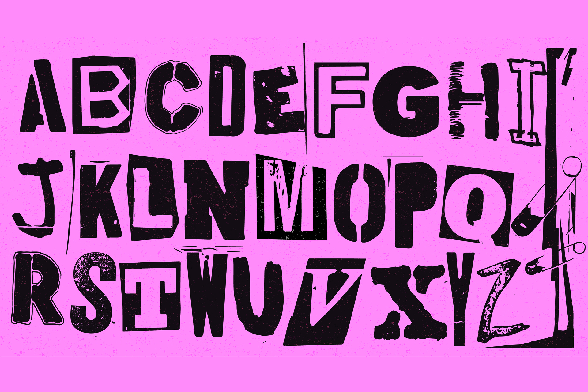
- Display Fonts: Display fonts are attention-grabbing and highly decorative. They are used for large headlines, titles, or logos to make a bold statement.
Understanding the characteristics of different font categories can help you make informed decisions when selecting fonts for your print designs.
3. Choosing the Right Font
3.1 Matching Fonts with Your Design Concept
When choosing fonts, it’s essential to consider the overall design concept and the message you want to convey. The font should align with the purpose and tone of your print materials. For example, if you’re creating a formal invitation, a sophisticated and elegant serif font might be more suitable. On the other hand, a playful and casual sans serif font could work well for a children’s event flyer.
3.2 Considering Readability and Legibility
While aesthetics are important, readability and legibility should never be compromised. Your font choices should ensure that the text is easy to read and understand. Factors such as font size, spacing, and contrast play a significant role in enhancing readability. Always test your design by printing or viewing it at different sizes to ensure the text remains clear and legible.
4. Combining Fonts Harmoniously
4.1 Creating Contrast and Hierarchy
Combining fonts can add depth and visual interest to your print designs. Creating contrast and hierarchy between different font elements helps guide the reader’s attention and highlights important information. For instance, you can pair a bold, attention-grabbing headline font with a simpler and more readable body font. This contrast creates a clear visual hierarchy and enhances the overall design composition.
4.2 Pairing Fonts with Similar Characteristics
When combining fonts, it’s important to maintain consistency and harmony. Choose fonts that have complementary characteristics, such as similar x-heights or letter shapes. This creates a cohesive and unified look throughout your design. Experiment with different font combinations and pay attention to how they interact with each other.
5. Paying Attention to Font Sizes and Spacing
5.1 Establishing Visual Hierarchy
Font sizes and spacing play a crucial role in establishing visual hierarchy within your print designs. Use larger font sizes for headlines or important information that you want to emphasize. Smaller font sizes can be used for secondary details or supporting text. Additionally, proper spacing between letters, lines, and paragraphs ensures readability and prevents your design from feeling cluttered.
5.2 Maintaining Consistency
Consistency in font sizes and spacing across your print materials helps create a cohesive and professional look. Define specific guidelines for headings, subheadings, body text, and other elements to maintain uniformity throughout your design. This consistency enhances the overall readability and visual appeal of your print materials.
6. Utilizing Font Styles and Variations
6.1 Bold, Italics, and Underlining
Font styles such as bold, italics, and underlining can be used to add emphasis and hierarchy within your text. However, use them sparingly and purposefully. Overusing these styles can make your design look cluttered and visually overwhelming. Reserve them for highlighting key points, important details, or calls to action.
6.2 Exploring Font Families and Weights
Many fonts come in various styles, known as font families or font weights. These variations can offer additional flexibility and options for your designs. Experiment with different font weights within the same family to create subtle contrasts or visual interest. This technique can be particularly effective when designing headings or subheadings.
7. Aligning Fonts with Brand Identity
7.1 Reflecting Brand Personality
Fonts play a vital role in reflecting and reinforcing your brand identity. Different fonts evoke different emotions and personalities. For example, a tech startup may opt for a sleek and modern sans serif font to convey innovation and forward-thinking, while a vintage clothing brand may choose a retro-inspired script font to evoke nostalgia and uniqueness. Align your font choices with your brand’s personality and values to create a consistent and memorable brand experience.
7.2 Creating Brand Recognition
Consistency in font usage across various print materials can contribute to brand recognition and recall. Select a set of fonts that align with your brand guidelines and use them consistently across different touchpoints. This includes brochures, business cards, packaging, and other print designs. Building a strong and recognizable brand identity through consistent font usage helps establish trust and familiarity with your audience.
8. Testing and Proofreading
8.1 Checking for Errors and Inconsistencies
Before finalizing your print designs, it’s crucial to test and proofread your text for any errors or inconsistencies. Check for typos, incorrect font styles or sizes, and spacing issues. Ensure that all the text is aligned correctly and flows smoothly within the design. A thorough review can save you from embarrassing mistakes and ensure a polished final product.
8.2 Seeking Feedback for Improvement
Don’t be afraid to seek feedback from others, such as colleagues, friends, or design professionals. They can provide valuable insights and fresh perspectives on your font choices and overall design. Constructive feedback can help you identify areas for improvement and refine your print materials to perfection.
9. Conclusion
Mastering font usage is essential for creating impactful print designs. By understanding the principles of typography, selecting the right fonts, and utilizing them effectively, you can elevate the visual appeal and effectiveness of your print materials. Pay attention to readability, hierarchy, consistency, and brand alignment to create designs that capture attention, convey messages, and leave a lasting impression.
10. FAQs (Frequently Asked Questions)
Q1. Can I use decorative fonts for body text in my print designs?
Decorative fonts are best reserved for headlines or short bursts of text. For body text, it’s recommended to use more legible and readable fonts to ensure a smooth reading experience.
Q2. How many fonts should I use in a single print design?
It’s generally recommended to use no more than two to three fonts in a single print design. Using too many fonts can make your design look chaotic and unprofessional.
Q3. Should I use free or paid fonts for my print designs?
Both free and paid fonts can be used effectively in print designs. Paid fonts often offer more extensive options and better quality, while free fonts can be a cost-effective solution, especially for personal or small-scale projects.
Q4. How can I test the readability of my print design’s fonts?
Print a sample of your design and view it from a distance or ask someone else to read it. This will help you gauge the readability of your fonts at different sizes and distances.
Q5. Can I use custom fonts in my print designs?
Yes, custom fonts can add a unique touch to your print designs. However, ensure that you have the appropriate licensing rights for the fonts you use, especially for commercial projects.