


In the world of print, colour plays a significant role in capturing attention, conveying messages, and creating impactful designs. Whether you are a designer, marketer, or someone who is simply curious about the fascinating realm of print, understanding the fundamentals of colour is essential. This article aims to provide a comprehensive overview of colour in print, its significance, and how it influences our perception.
Table of Contents
- Introduction: The Power of Colour in Print
- The Basics of the Colour Wheel
- The Psychology of Colour
- Colour Models in Printing
- RGB vs. CMYK: Understanding the Difference
- Colour Management in Print
- Spot Colour and Pantone Matching System
- Colour Correction Techniques
- Colour Gamut: Limitations and Considerations
- Choosing the Right Colour for Your Design
- The Impact of Colour on Branding
- Colour Theory in Print Advertising
- Printing Techniques and Colour Reproduction
- Colour and Paper Selection
- Case Studies: Effective Use of Colour in Print Design
1. Introduction: The Power of Colour in Print
Colour is an incredibly powerful tool that can evoke emotions, trigger memories, and influence decision-making. In the world of print, where visual communication is paramount, understanding the nuances of colour is crucial. From eye-catching logos to attention-grabbing advertisements, the right choice and application of colour can make all the difference in creating a lasting impact.
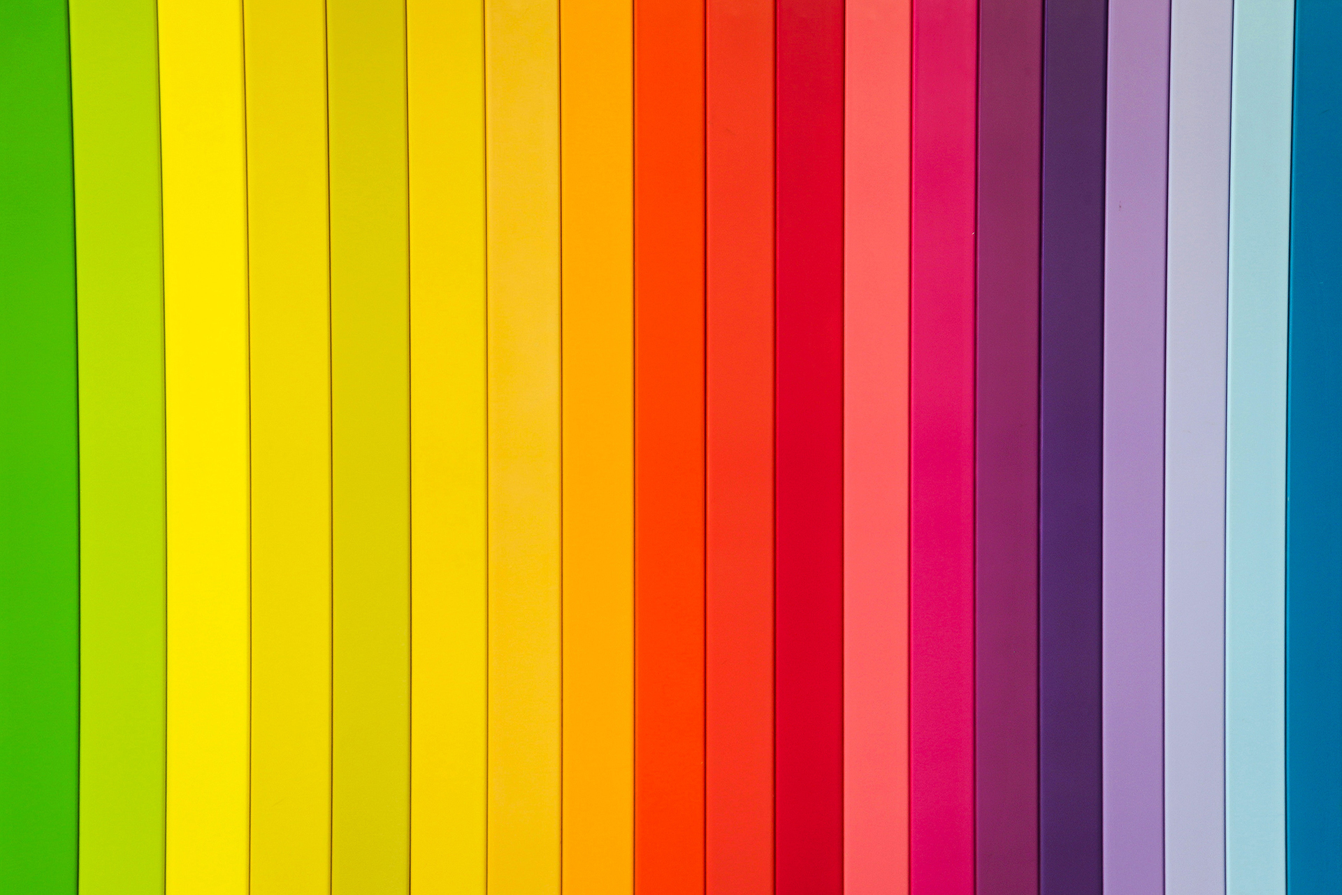
2. The Basics of the Colour Wheel
The colour wheel is a fundamental concept in understanding colour theory. It consists of primary, secondary, and tertiary colours arranged in a circular format. The primary colours, namely red, blue, and yellow, are the building blocks of all other colours. Secondary colours, such as green, orange, and purple, are created by mixing primary colours. Tertiary colours result from further mixing primary and secondary colours.
3. The Psychology of Colour
Colours have psychological associations and can elicit specific emotional responses. For example, red is often associated with passion and excitement, while blue conveys calmness and trust. Understanding the psychology of colours allows designers to strategically use them to convey desired messages and evoke specific feelings in their audience.
4. Colour Models in Printing
In the world of printing, two primary colour models are used: RGB (Red, Green, Blue) and CMYK (Cyan, Magenta, Yellow, Black). RGB is used for digital displays, while CMYK is the standard for print reproduction. Each model has its own colour space, and it is crucial to consider these differences when designing for print.
5. RGB vs. CMYK: Understanding the Difference
RGB and CMYK have different colour gamuts and work on contrasting principles. RGB relies on additive colour mixing, where the combination of red, green, and blue light creates various colours. On the other hand, CMYK follows subtractive colour mixing, where overlapping ink pigments absorb specific wavelengths of light. Understanding these differences is vital to ensure accurate colour reproduction in print.
6. Colour Management in Print
Colour management is the process of maintaining consistent and predictable colours throughout the print workflow. It involves calibrating devices, creating colour profiles, and ensuring accurate colour reproduction across different output devices. Effective colour management ensures that the colours you see on your screen match the final printed output.
7. Spot Colour and Pantone Matching System
Spot colours are pre-mixed ink colours that provide consistent and accurate results. They are commonly used in branding and corporate identity, ensuring precise colour reproduction across various print materials. The Pantone Matching System (PMS) is a widely recognized standard for spot colours, allowing designers and printers to achieve consistent colour accuracy.
8. Colour Correction Techniques
In print production, colour correction techniques are used to adjust and enhance colours for optimal results. These techniques involve adjusting brightness, contrast, saturation, and hue to achieve the desired visual impact. Colour correction is essential for maintaining brand consistency and ensuring accurate representation of images and graphics.
9. Colour Gamut: Limitations and Considerations
Every colour model has a defined colour gamut, representing the range of colours it can reproduce. Printers have limitations in reproducing certain colours, particularly vibrant and intense hues. Understanding the limitations of the chosen printing process and colour model is crucial for accurate colour representation in print.
10. Choosing the Right Colour for Your Design
Selecting the right colours for your design requires a thoughtful approach. Consider the target audience, the intended message, and the desired emotional response. Colour combinations, contrast, and harmony should be taken into account to create visually appealing and engaging print materials.
11. The Impact of Colour on Branding
Colour plays a vital role in branding, as it helps establish brand recognition and evoke specific associations. Consistent use of colours across various print and digital platforms reinforces brand identity and strengthens brand recall. Understanding the impact of colour on branding allows businesses to establish a strong visual presence and connect with their target market.
12. Colour Theory in Print Advertising
Print advertising relies heavily on colour to capture attention and convey messages effectively. Different industries and target audiences may respond better to specific colours, and understanding these preferences can optimize the impact of print ads. Colour theory in print advertising involves strategic colour selection and combination to create visually compelling and persuasive advertisements.
13. Printing Techniques and Colour Reproduction
Various printing techniques affect how colours are reproduced in print. Offset printing, digital printing, and screen printing each have their own characteristics and limitations when it comes to colour accuracy and reproduction. Familiarizing oneself with these techniques helps ensure the best possible results for a given print project.
14. Colour and Paper Selection
The choice of paper also influences colour perception in print. Factors such as paper finish, brightness, and opacity can affect how colours appear to the viewer. Designers must consider these factors and select the appropriate paper type to achieve the desired visual impact.
15. Case Studies: Effective Use of Colour in Print Design
Examining successful case studies in print design provides valuable insights into how colour can be effectively utilized. By analyzing real-world examples, designers can learn from best practices and understand how to make their own print materials visually appealing and impactful.
Conclusion
Understanding the intricacies of colour in the world of print is essential for designers, marketers, and anyone involved in visual communication. By grasping the basics of the colour wheel, psychology of colour, and colour models in printing, one can create compelling designs that resonate with the intended audience. Effective colour management, spot colour usage, and colour correction techniques ensure accurate representation in print. Ultimately, by harnessing the power of colour, one can unlock the true potential of print as a medium for creativity and expression.
FAQs
- What is the significance of colour in print design? Colour plays a vital role in print design as it captures attention, conveys messages, and evokes emotions. It helps establish brand identity and enhances the overall impact of printed materials.
- What is the difference between RGB and CMYK? RGB is a colour model used for digital displays, while CMYK is the standard for print reproduction. RGB relies on additive colour mixing, while CMYK follows subtractive colour mixing.
- How does colour management impact print quality? Colour management ensures consistent and accurate colours throughout the print workflow, resulting in high-quality print output that matches the designer’s intent.
- What is spot colour and the Pantone Matching System? Spot colours are pre-mixed ink colours used for consistent and accurate reproduction. The Pantone Matching System (PMS) is a standardized system for spot colours, allowing precise colour matching.
- Why is colour selection important in print advertising? Colour selection in print advertising impacts the effectiveness of the message and helps create visual appeal. Different colours evoke different emotions and can influence consumer behavior.